How to Design a Pop-up Banner That Actually Stops Traffic
How to Design a Pop-up Banner That Actually Stops Traffic
Walk into any expo or conference and you’ll see it: rows of pop-up banners and almost no one reading them.
At busy venues like the Ventura Fairgrounds or hotel conference centers across Ventura County, attention is limited to seconds. If your banner doesn’t communicate instantly, it’s invisible. This guide breaks down retractable banner design that actually stops foot traffic and pulls people into your booth.
Why Most Pop-up Banners Get Ignored
Most banners fail for the same reasons:
Too much text
No clear message
Small fonts that can’t be read from 10 feet away
Generic stock photos
Weak or missing call to action
At expos, your banner isn’t read: it’s scanned.
The #1 Rule of Retractable Banner Design
One banner equals one message. It should not contain your full service list, your company history, or every logo variation you own. Instead, your banner should answer one question instantly:
👉 “Why should I stop here?”
Examples:
“Custom Banners Printed Locally in Ventura County”
“Need Signs Fast? We Meet On Site Deadlines.”
Layout That Stops People Mid Walk
A high performing retractable banner follows a simple visual hierarchy:
Bold headline
Readable from 15 20 feet
Focused on the visitor’s problem or benefit
Middle (The Proof)
One strong image or visual
Product in real world use (booths, storefronts, events)
Minimal supporting text
Bottom (The Action)
Logo
Phone number or short URL
Simple CTA like “Visit Our Booth” or “Ask About 3 Day Printing”
If it doesn’t fit this structure, it doesn’t belong on the banner.
Fonts, Colors, and Images That Actually Work
Fonts
Sans serif only (clean, bold, readable)
Avoid thin or decorative fonts
Keep text large: bigger than you think
Colors
High contrast (dark text on light background or vice versa)
Avoid busy gradients
Stick to brand colors but prioritize readability
Images
Real photos beat stock
Show scale: banners, booths, signs in use
One strong image is better than three weak ones
Remember: people are walking, talking, and distracted.
Common Design Mistakes Businesses Make at Expos
Avoid these traffic killers:
Listing every service you offer
Using paragraphs instead of short phrases
Putting the logo at the top and the message at the bottom
Forgetting contact info entirely
Designing for a screen instead of real world viewing distance
A banner is not a flyer. Treat it differently.
Pro Tip from a Local Print Expert
“Design your banner by standing 10 feet away from your screen. If you can’t understand it in three seconds, neither can your audience.”
At Where2Print, we review banner designs before printing to catch these issues early.
Designing for Ventura Fairgrounds & Hotel Conferences
Expos at the Ventura Fairgrounds and hotel ballrooms are:
Visually crowded
Brightly lit
Filled with competing signage
That means your banner must be readable from across an aisle, use heavier weight material to prevent curling, and be paired with a sturdy retractable stand. Cheap stands wobble. Cheap prints look dull. Both hurt credibility.
Final Takeaway: Simple Wins
The best retractable banner design isn’t clever: it’s clear. If your banner communicates one strong message, can be read instantly, and tells people exactly what to do next, you’ll stop traffic even in the busiest expo hall.
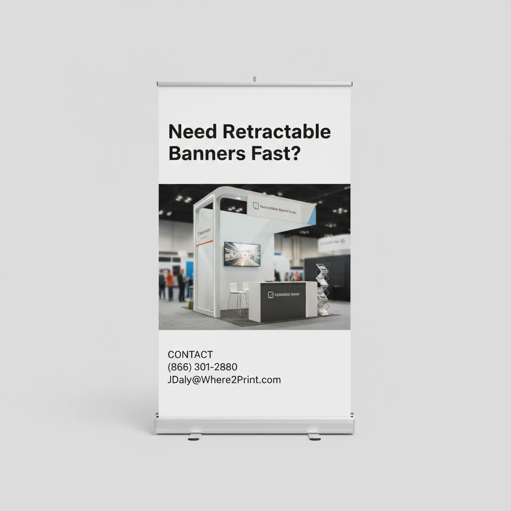
Ready to Print a Pop-up Banner Fast?
Need retractable banners fast in Thousand Oaks?

Call Where2Print at 866.301.2880 or click here to Get a Quick Quote. We help businesses exhibiting across Thousand Oaks, Ventura, Camarillo, Simi Valley, and Westlake Village stand out at expos, trade shows, and hotel conferences with banners that actually get noticed.
